Free Root Cause Analysis templates (and how to use them)

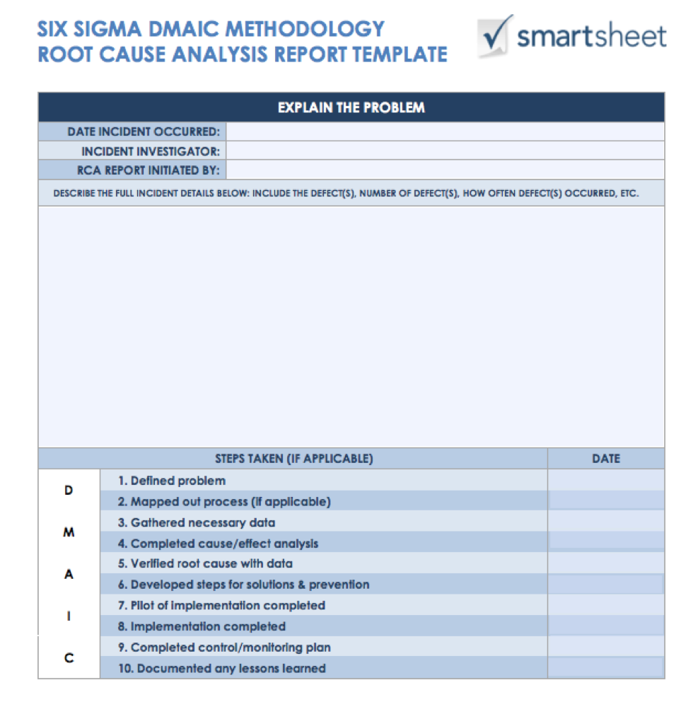
A person begins a root causes analysis after a problem or incident. Templates and documentation help disentangle the reasons an incident occurred and record factors, such as the location of the incident and who was involved. At the end of the analysis, you'll hopefully have a solution or procedure in place to prevent the same incident from occurring again.


Share